

How to Spot a Fraudulent Bottle (& Why Provenance Matters)
Wine is meant to be enjoyed, shared, and remembered, not second-guessed. As fine wine has become more collectible, valuable and globally traded, wine fraud has quietly increased.
Although we have come across a few fakes recently, the good news is that fraud is still relatively rare, and it is heavily concentrated at towards the top end of the market. The even better news is that with a little knowledge, and with the right retailer, it’s avoidable.
This guide shows a real example, and explains what wine fraud looks like, how we assess wines and the risk, and why provenance matters more than any single label detail.
A Real Example:
When One Detail Isn’t Enough
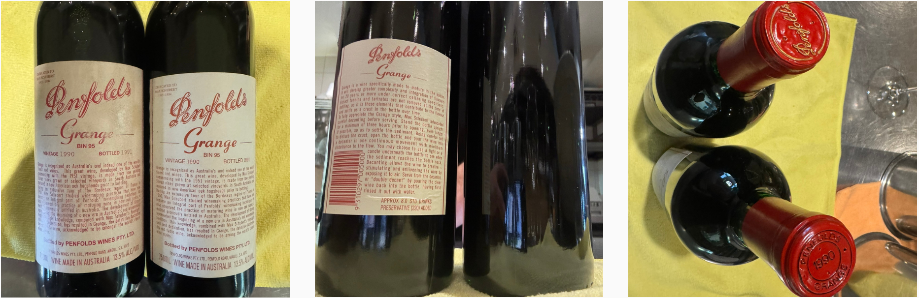
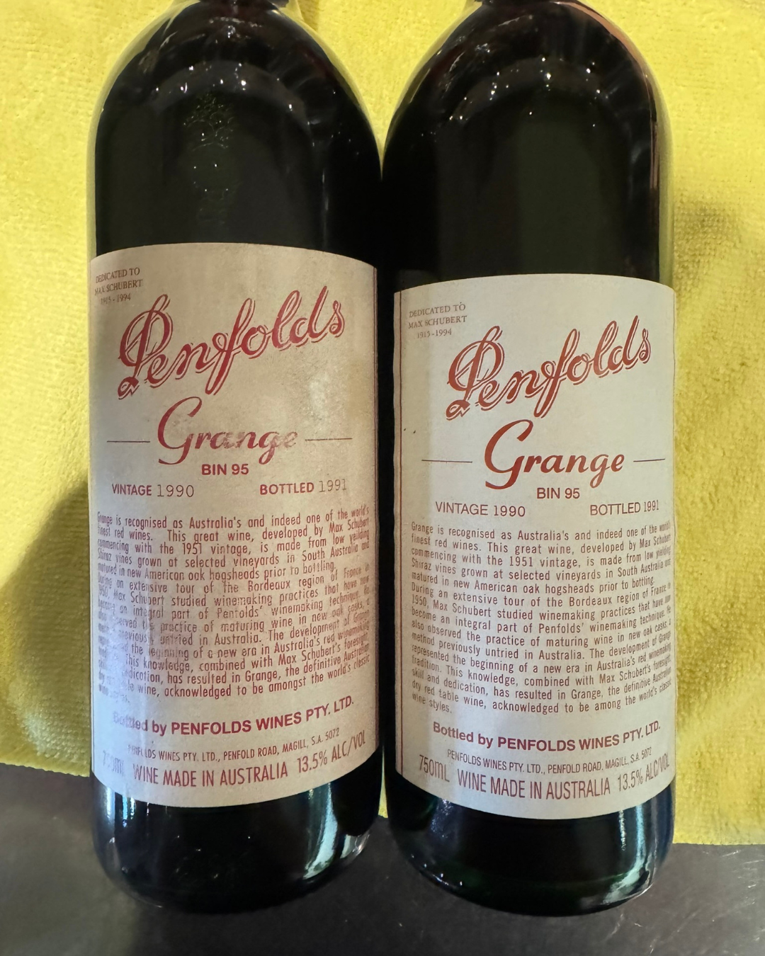
Recently, we examined two bottles of the same famous Australian wine from the same vintage. At first glance, both looked convincing. The wording was correct. The design was familiar. Nothing jumped out immediately.
But authentication does not work on gut feeling. It works by layering evidence.
Let’s walk through what matters.
What Is Wine Fraud?
Wine fraud is rarely obvious or clumsy. In fact, the most convincing fakes are often the most dangerous.
Common forms include:
Authentic bottles that have been refilled
Reproduced labels applied to old or generic bottles
Correct producers and vintages, but incorrect bottlings
Wines presented without clear storage or ownership history
Importantly, fraud is not about everyday drinking wines… It overwhelmingly targets iconic producers, older vintages, highly collectible bottles, and wines traded on the secondary market.
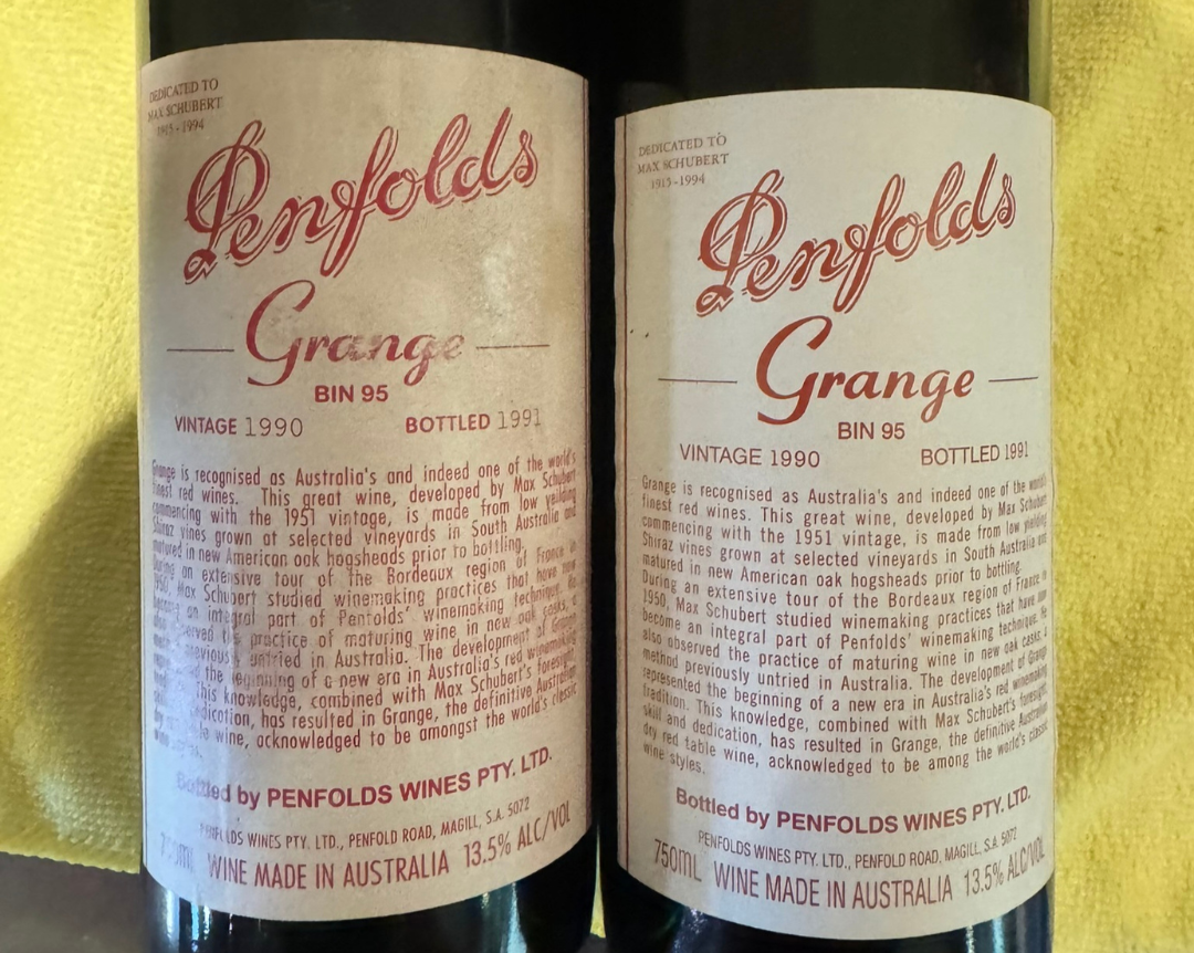
1. Front Label: What Looks Right, & What Doesn’t
The wording itself
First, the important part.
There are no spelling mistakes.
No incorrect names.
No wrong vintage information.
Everything written on the front label is technically correct for the wine and the year. This is exactly what you would expect from a convincing counterfeit. The problem isn’t what the label says.
The print quality and typography ❌
This is where subtle differences start to appear.
One label shows heavier, muddier ink, particularly in the red text
The serif lettering looks slightly soft rather than crisp
Fine details like commas and letter edges lack sharp definition
Spacing between letters and words varies slightly
Font weight appears inconsistent across different lines of text
Authentic labels from major producers were printed in large, controlled runs. These kinds of variations should not appear bottle to bottle.
Alignment and layout ❌
The overall layout raises further questions.
Some text lines sit slightly out of alignment with others
The spacing between “BIN 95,” “VINTAGE 1990,” and “BOTTLED 1991” is inconsistent
The dedication line appears lighter and less integrated into the overall design
These are small details, but large producers like Penfolds were extremely consistent during this period.
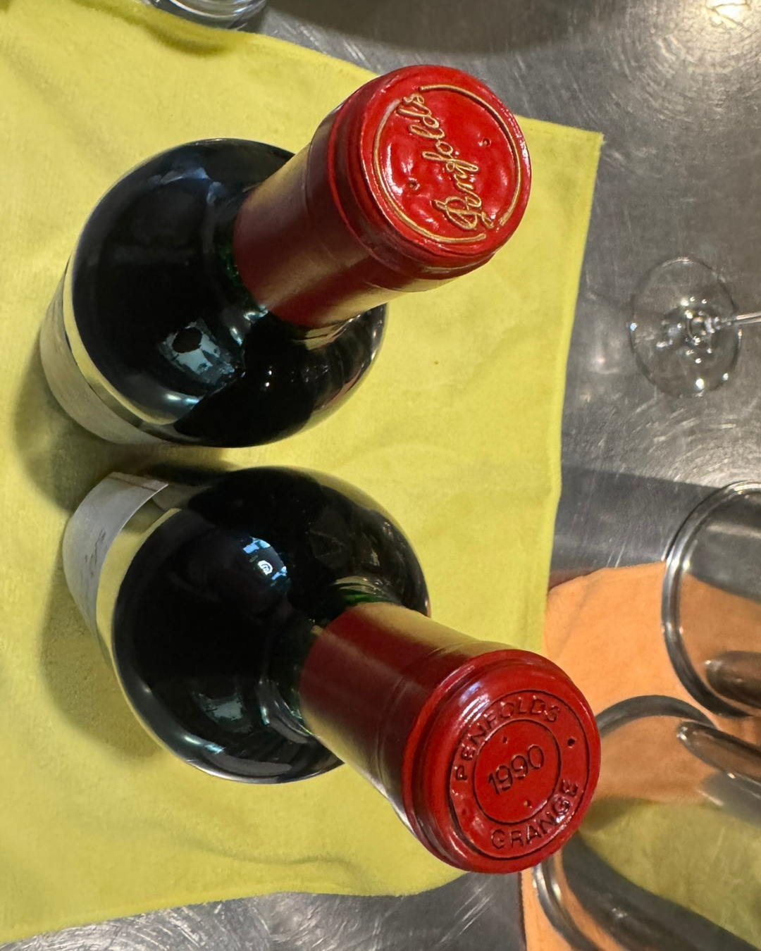
2. The Capsule: One of the Strongest Tells ❌
Capsules are notoriously difficult to reproduce accurately, and they often reveal more than labels.
One capsule shows only the Penfolds script
Authentic examples from this vintage show “PENFOLDS 1990 GRANGE” embossed on the top
The embossing on the script-only capsule is shallower and less defined
The capsule itself appears generic rather than Grange-specific
A capsule that is almost right is often more concerning than one that is clearly wrong.
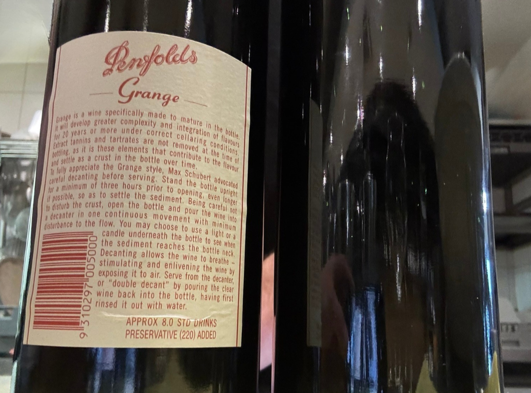
3. The Back Label: Where the Story Breaks ❌
This is where inconsistencies become much harder to explain.
A barcode appears on the back label, which was not used on original releases from this era
Modern regulatory language is present
The “approximate standard drinks” statement reflects later labelling requirements
Preservative declarations are formatted in a way that post-dates the vintage
Labelling laws change over time. When a back label reflects modern regulations on an older wine, it strongly suggests later relabelling or repackaging.
4. The Bigger Issue: Mismatched Eras
Individually, any one of these details could be dismissed.
Together, they form a pattern:
Correct wording paired with inconsistent print quality
A convincing front label paired with an era-incorrect capsule
Historic design elements combined with modern regulatory language
In short, the components do not appear to belong to the same moment in time.
5. Why This Matters
Wine authentication isn’t about proving fraud beyond doubt. It’s about whether a bottle can be confidently represented as an original release.
When multiple elements don’t align, reputable merchants, auction houses and insurers all reach the same conclusion. The risk is too high.
At that point, the correct decision is simple. You walk away.
The Key Takeaway
The most convincing fake wines rarely give themselves away through spelling mistakes or obvious errors. They copy the words perfectly and fail in the details.
That’s why professionals look at the whole picture, not just the label.
And it’s why provenance, consistency and trust matter far more than a single glance at a bottle.
At Lamont’s We Evaluate and Stand Behind Every Bottle
When it comes to older, rare, or collectible wines, we take a deliberately conservative approach. Every bottle we sell is assessed with the same question in mind: would we be comfortable cellaring or opening this ourselves?
From there, each bottle is assessed as a whole. Label quality, typography and alignment are considered alongside capsule style and embossing, back label format and regulatory language, and fill level appropriate to the wine’s age. No single detail determines the outcome. What matters is that every element makes sense together and belongs to the same moment in time.
We ask the awkward questions so all that’s left for you is the opening!
Buying Fine or Older Wine? Here’s What to Watch Out For
Most wine lovers will never encounter a fake bottle. But when you’re buying something rare, old, or valuable, these are the details worth paying attention to. None of them prove fraud on their own, but together they help build a clearer picture.
1. No Clear Provenance
Provenance is the wine’s life story.
Extra care is needed if:
The seller can’t clearly explain where the wine came from
There’s no storage or ownership history
The story changes when questions are asked
Documentation is vague or missing
A bottle with a simple, boring history is usually safer than an exciting one with gaps.
2. Labels That Look Right, But Not Quite Right
Spelling mistakes are uncommon in serious counterfeits. Instead, look for subtle execution issues.
Watch for:
Fonts that look soft, blurry, or inconsistent
Ink that appears too heavy or too fresh for the wine’s age
Uneven spacing or alignment
Labels that look uniformly aged rather than naturally worn
Authentic older labels usually show irregular ageing, not perfect patina.
3. Capsules That Don’t Match the Era
Capsules are one of the hardest elements to reproduce accurately.
Be cautious if:
The capsule branding doesn’t match the wine and the vintage
Embossing looks shallow or poorly defined
A generic capsule appears on an iconic wine
The capsule looks noticeably newer than the bottle
If the capsule doesn’t match the era, it’s a major red flag.
4. Modern Back Labels on Older Wines
This is one of the most overlooked signs.
Extra caution is needed if an older wine has:
Barcodes that didn’t exist at the time of release
Modern regulatory wording
Contemporary standard drinks declarations
Label formats inconsistent with the vintage
Labelling laws evolve. Bottles don’t.
5. Fill Levels That Don’t Make Sense
Some ullage is normal in older wines. Uniformity is not.
Watch for:
Very high fills on very old bottles
Multiple bottles with identical fill levels
Inconsistent fills within the same case
Natural ageing creates variation, not precision.
6. The Cork (When It’s Available)
The cork is one of the most revealing elements, especially once a bottle is opened.
Things to watch for:
Branding that doesn’t match the producer or era
Fonts or logos that look modern
Corks that are unusually short for a flagship wine
A cork that looks pristine on a very old bottle
Little or no wine staining after decades of ageing
Texture that feels dry, brittle, or oddly neutral in smell
A genuine old cork usually looks old. One that looks too new can be just as concerning as one that’s falling apart.